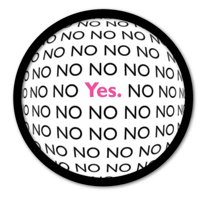
The design process for my final logo was very similar to that of my draft logo – since I had already created a rough vision, my design process for the final could be seen more as editing, as the design remained essentially the same. The notable differences in the final logo reflect further practice and experimentation with the tools within Illustrator. I also took into account much of the commentary provided by my class and group mates. One of the suggestions that really helped was with the placement of the word “YES” on the logo as well as adding a shadow to the circle that was meant to represent the world or “Earth” full of “no’s.”
In reflecting how the design elements relate to my topic – I feel that images presented in the logo truly emulate the culture, goals and messages that YES has shared and will share in the future. The logo clearly is a nod to the projected slogan: In A World of No, Get Yes. I also feel that by giving the YES in the middle a simple design and space in comparison to the no’s (which were placed in bold and given lining around the edge of the letters to give them a deeper, more serious effect), really demonstrated the simple idea behind the word Yes, and what is means to the YES project as a whole.
As for the technical details – I took the advice from a peer critique to give the world a glow. I added the circle by using the ellipses tool, and stretching it to my desired size. I then increased the pt/thickness of the world to make the line more bold and stand out more. After finding my desired thickness, I added the glow/drop shadow.
The text was added by using the text box tool. Before beginning to type out my No’s, I used the text path tool so that the text would just stay within the circle I had previously created. I then added my simple YES in the middle of the circle. To give the circle and effect of globe or Earth, I set the text to have the Fisheye effect. I stretched it out manually until I was satisfied with the angle and overall look.
I chose to not recreate the gray in the background, as was seen in my draft. I felt that by leaving out the gray, it gave the logo a much cleaner and polished look.
