Going into the logo project, I was extremely nervous. I had never created a logo before, and the task of creating something that was meant to represent as well as create an idea or company, etc., seemed somewhat daunting. So my first task was to find an topic to create a logo for. After much browsing and web searching, I realized I had the perfect idea to make a logo for – my new project: Y.E.S.
Y.E.S. stands for “Young, Educated, and Strapped.” It is a non-profit that I began at the beginning of the summer that will be doing its first courses of action in August. The first major feat of Y.E.S. was purchasing old (even broken) furniture. With the help of friends and Pinterest, I was able to rufurbish the furniture I gathered. I distributed the furniture about a week ago to students in Pullman who were transitioning from dorms to off-campus housing and found themselves strapped for cash – but still in need of furniture. In the future, I hope to also give out scholarships, grocery and gas funds, and supply internship and job placement for recent grads.
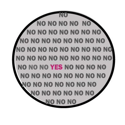
Once settled on my idea, I decided to come up with a slogan. I decided on the website title I have chosen for the website that will launch this fall. “In a World of No, Get Yes.” (The site will be called getyes.org). So my idea was to create a simple, mod-inspired image of a globe. I wanted to fill the globe with the word “NO.” In the midst of the “NO” I wanted one simple “YES” in a bright color. In the final version, the “yes” will be placed approximately where Washington is located on the globe in homage to my school and home state.
I created the circle and filled it with a light gray. I then added the NO’s and changed their color to a lighter gray. To make the words fit, I transformed the textbox to the circle I initially created. I also added a border to the circle to give it a more polished look. I also changed the opacity to give the “YES” an extra pop, and kept that at 100%.
Looking forward to the classes input and ideas for improvement!

Hey Jasmine! I really like your overall idea for you logo! I think that is a really cool idea and thing you did. I think you are on the right track with your logo and how you want it to look. One thing you should make sure you do is talk about the course material like ground/figure so you get those points. I only have a few things you could maybe do to your logo. I would maybe try and make the NOs that are on the edge inside the circle. I can see some are kind of out of the circle. Also you could maybe play with shadows like out glow and drop shadows to make it stand out more. Like the YES and circle. I think you are pretty much done with your logo though! Good job and I can’t wait to see your final logo.
Great job on your draft logo! I really liked the creativity that you used and how you allowed the yes to stand out in a different color. My first suggestion would be that you might want to make the circle a little bit bigger to make sure that the “no’s” don’t lap over the stroke of the circle. Another detail that could look really cool is if you gave the outer circle and outer glow. It might look really good if you even used the same color as the “yes” to use as the outer glow. Another suggestion I have is to make the stroke of the circle just a tiny bit thicker. This will allow the circle to stand out better and give it the look of a bolder statement. Other than that I thought you did a great job constructing your logo. You demonstrated that you understand the tools of Adobe Illustrator.
“In a World of No, Get Yes.” I like that saying; it gives meaning to your logo. Also your furniture project sounds cool. In terms of improving your logo, I would maybe make the circle larger so that it would fit in all of the wording and make the YES more centered, maybe even in a larger font than the other entire no’s. I like your simple message; like in the comment you left me I agree that simple messages tend to be the strongest and easiest to interpret. The gray shading on the inside of the circle is a little off on the lower left, so you can touch that up. You could also add different effects to the test on the inside; maybe give all the no’s one style and the yes another that way it would stand out even more. All in all I like your logo and the idea behind it, good luck with the business that you are going to start.
Jasmine
Simple designs like this are so neat and can have a real impact on your audience. Repeating no throughout your logo and having that one yes gives that “yes” a stronger visual attraction which is smart. I also thought your color choices for this were visually appealing as well. Some improvements you could make would be to center the no’s in the circle more and make the boarders even to it. Also there is some white in the bottom left in the inside of the circle that you should fill in. You might also want to think about any other creative designs you could add-on to this. Even though simple is good, I just know you could add something more to it and still have the simplicity you’re trying to display. Overall great logo, just put more time into this project and I’m sure your final will look amazing.